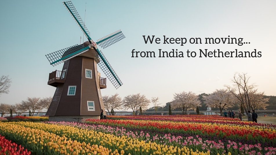
The biggest event in our family that year was our move from India to the Netherlands. After two years of living in India, where every day was exciting, we moved to the Netherlands. I made this big change into the design of our New Year’s card.
In India, Indian style breads(?) such as naan, chapati, and parathas were very tasty, but I never had a chance to eat the delicious breads of the West. In India, Indian-style breads (?) such as naan, chapati, and parathas were very tasty, but I never had a chance to eat good breads in general in the West. When I arrived in the Netherlands, I remember being impressed by the deliciousness of a 0.3€ (about 40 yen) croissant that I casually bought at a supermarket. (After that, the bread I ate at bakeries and in France was still better, and I almost forgot how good that supermarket croissant was. I’m afraid of “getting used to it.)
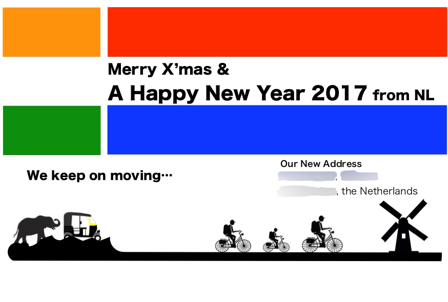
Points of Design
- India to the Netherlands: The horizontal axis represents the change from India to the Netherlands, with January to March (3 months) in India and April to December (9 months) in the Netherlands.
- National flag motif: The colors of the national flags of India and the Netherlands were included in the design because (1) both flags are based on three colors, with the middle color being white, and (2) both flags have a horizontal border layout.
- Symbols for each country: Elephants and rickshaws (three-wheeled open cabs) for India; bicycles and windmills for the Netherlands. Three bicycles represent a family of three.
- Geography and road conditions: India is surrounded by mountains and has many ups and downs, and the roads are not sufficiently paved and uneven, while the Netherlands has no mountains and flat roads (the highest peak is 322m, and about 1/4 of the country is below 0m above sea level).
The photo of my son’s face is also gone from here. It was a simple design, but in reality, it was a year of upheaval.
